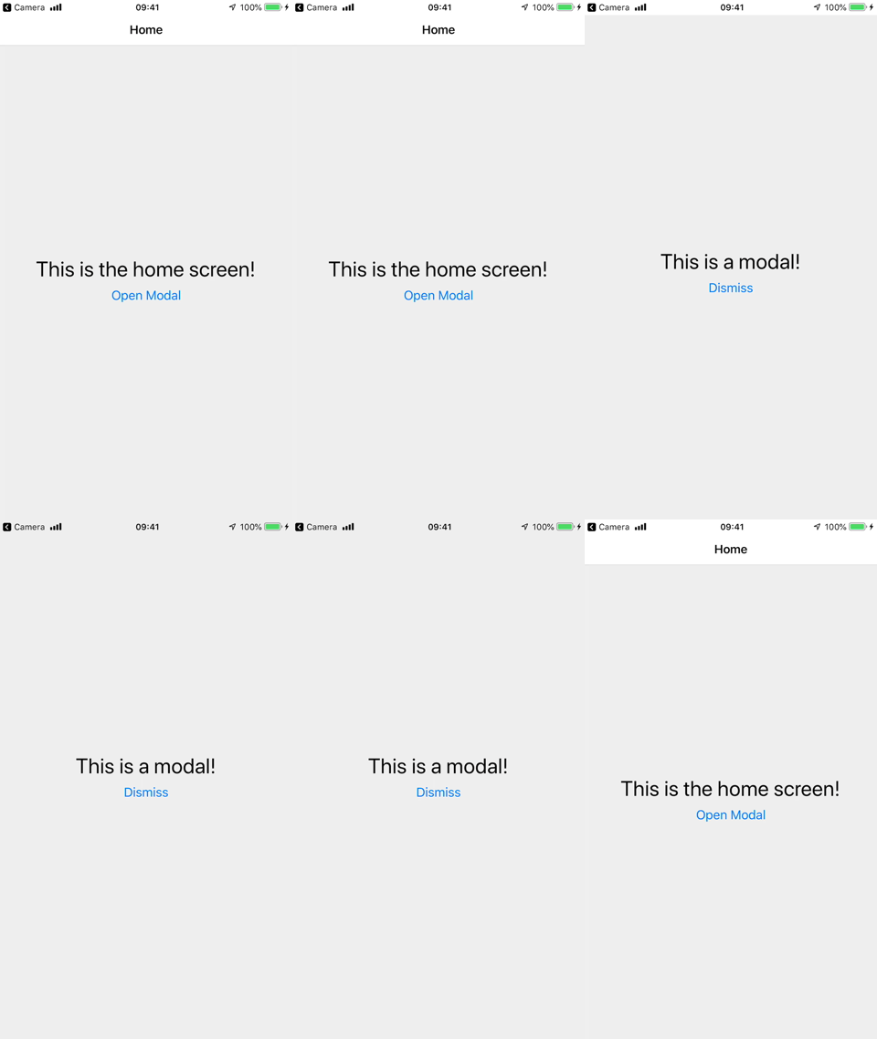
Opening a modal

A modal displays content that temporarily blocks interactions with the main view.
A modal is like a popup — it usually has a different transition animation, and is intended to focus on one particular interaction or piece of content.
Creating a stack with modal screens
- Static
- Dynamic
const HomeStack = createStackNavigator({
  screens: {
    Home: {
      screen: HomeScreen,
      options: {
        headerShown: false,
      },
    },
    Details: {
      screen: DetailsScreen,
      options: {
        headerShown: false,
      },
    },
  },
});

const RootStack = createStackNavigator({
  groups: {
    Home: {
      screens: {
        App: {
          screen: HomeStack,
          options: { title: 'My App' },
        },
      },
    },
    Modal: {
      screenOptions: {
        presentation: 'modal',
      },
      screens: {
        MyModal: ModalScreen,
      },
    },
  },
});

const Navigation = createStaticNavigation(RootStack);

export default function App() {
  return <Navigation />;
}
const Stack = createStackNavigator();

function HomeStack() {
  return (
    <Stack.Navigator>
      <Stack.Screen
        name="Home"
        component={HomeScreen}
        options={{
          headerShown: false,
        }}
      />
      <Stack.Screen
        name="Details"
        component={DetailsScreen}
        options={{
          headerShown: false,
        }}
      />
    </Stack.Navigator>
  );
}

const StackA = createStackNavigator();

function RootStack() {
  return (
    <StackA.Navigator>
      <StackA.Group navigationKey="Home">
        <StackA.Screen
          name="App"
          component={HomeStack}
          options={{ title: 'My App' }}
        />
      </StackA.Group>
      <StackA.Group
        navigationKey="Modal"
        screenOptions={{
          presentation: 'modal',
        }}
      >
        <StackA.Screen name="MyModal" component={ModalScreen} />
      </StackA.Group>
    </StackA.Navigator>
  );
}

export default function App() {
  return (
    <NavigationContainer>
      <RootStack />
    </NavigationContainer>
  );
}
Here, we are creating 2 groups of screens using the RootStack.Group component. The first group is for our regular screens, and the second group is for our modal screens. For the modal group, we have specified presentation: 'modal' in screenOptions. This will apply this option to all the screens inside the group. This option will change the animation for the screens to animate from bottom-to-top rather than right to left. The presentation option for stack navigator can be either card (default) or modal. The modal behavior slides the screen in from the bottom and allows the user to swipe down from the top to dismiss it on iOS.
Instead of specifying this option for a group, it's also possible to specify it for a single screen using the options prop on RootStack.Screen.
Summary
- To change the type of transition on a stack navigator you can use the
presentationoption. - When
presentationis set tomodal, the screens behave like a modal, i.e. they have a bottom to top transition and may show part of the previous screen in the background. - Setting
presentation: 'modal'on a group makes all the screens in the group modals, so to use non-modal transitions on other screens, we add another group with the default configuration.
Best practices
Since modals are intended to be on top of other content, there are a couple of things to keep in mind when using modals:
- Avoid nesting them inside other navigators like tab or drawer. Modal screens should be defined as part of the root stack.
- Modal screens should be the last in the stack - avoid pushing regular screens on top of modals.
- The first screen in a stack appears as a regular screen even if configured as a modal, since there is no screen before it to show behind. So always make sure that modal screens are pushed on top of a regular screen or another modal screen.